Correlation Heatmap with Seaborn
In this guide, we’ll explore how to create a correlation heatmap using Seaborn in Python. A heatmap is a powerful visualization tool that highlights important relationships between features and their connection to the target variable (y-value). We’ll cover two common types: the standard heatmap and the triangular heatmap.
The data I used is from Berlin V2X paper which collected ML dataset from multiple vehciles and radio access technologies. You can access them here if you are interested.
1. Installation
Import the following packages.
2. Load Dataframe
I created a
.ipynbfile to process things step by step. You can choose whatever you’re comfortable with.
Load the data you will visualize, and display the first few rows to see the number/types of columns you have.
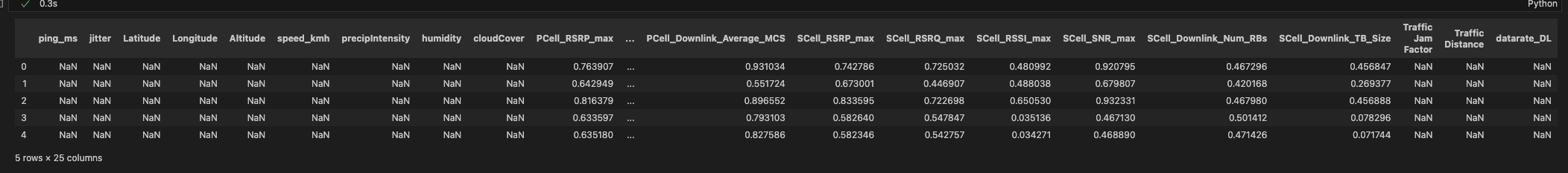
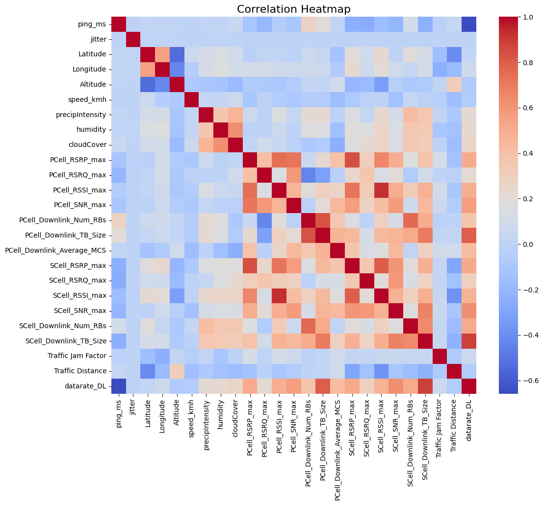
Here, I have 25 columns so my heatmap will be a 25 x 25.
Perform Simple Preprocessing
Since all of the values need to be in number in order to create the heatmap, perform appropriate preprocessing.
Run the code below to view the data types of all columns.
The datarate_DL column in my dataset is currently of type object, but the values are actually numerical data stored as strings. I will convert this column to a numeric type with the code below. Again, perform approriate preprocessing depeding on your dataset.
3. Create a Correlation Matrix
Now create a correlation matrix between all features & the y-variable.
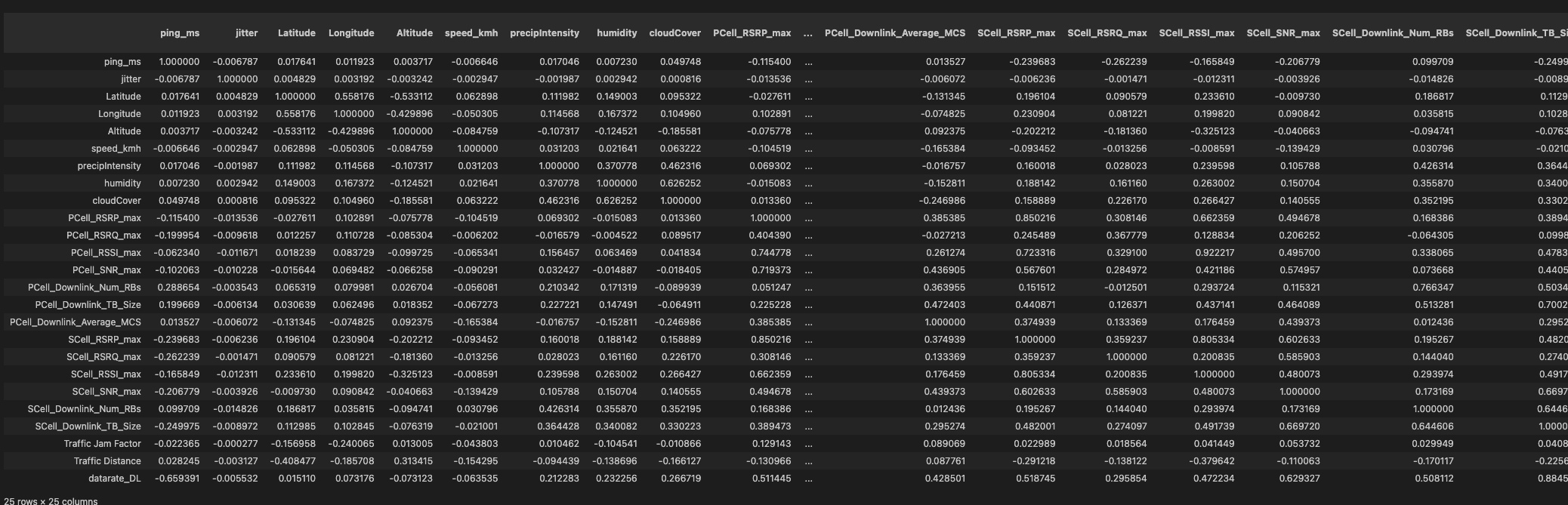
A correlation matrix with all the variables. This dataframe is 25 x 25.
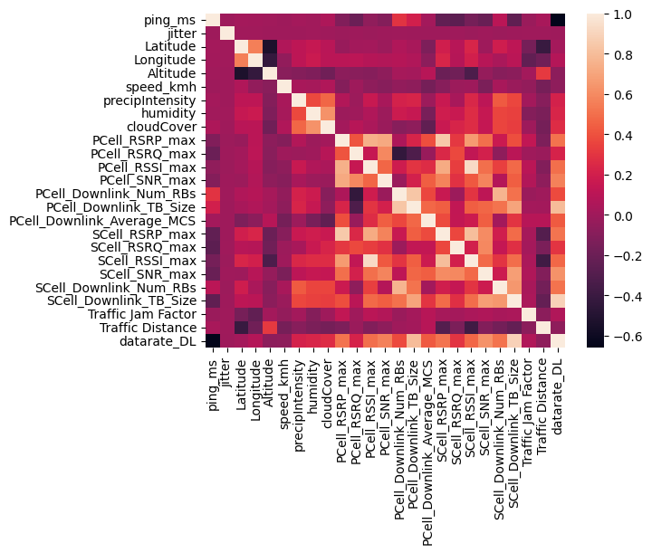
4. Generate Basic Heatmap
Run the code below, and you will be able to see the most basic seaborn correlation heatmap with no modification.
Change Parametrs
From here, you can change some argument variables to make it more easier to view. Refer to the official documentation for the list of parameters.
| Parameters | Desc |
|---|---|
vmin, vmax |
set the range of values that serve as the basis for the colormap. |
cmap |
sets the specific colormap we want to use. check the resource for a list of colour palettes. |
annot |
when set to True, the correlation values become visible on the coloured cells |
cbar |
when set to False, the colourbar on the side for legend disappears |
With matplotlib, I also set the overall figure size and the title.
plt.figure(figsize=(12, 10))
sns.heatmap(correlation_matrix, fmt=".2f", cmap="coolwarm")
plt.title("Correlation Heatmap", fontsize=16)
plt.show()
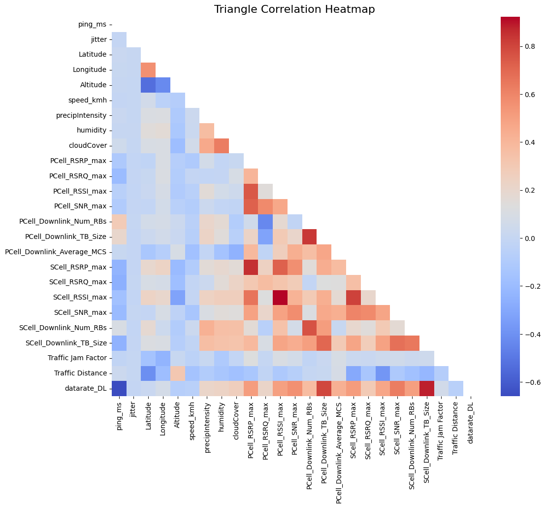
5. Generate Triangular Heatmap
Since this is a 25 x 25 heatmap with 25 variables, half of the correlations are redundant as they are identical to the other half. Additionally, the diagonal elements, representing correlations of variables with themselves, can be misleading/unnecessary in the analysis. To resolve these issues, you can generate a triangular heatmap that only displays lower half of the heatmap.
This can be done by creating a mask. get_lower_tri() will only leave the lower triangle of our heatmap by masking a boolean matrix.
def get_lower_tri(corr_matrix):
    mask = np.triu(np.ones_like(corr_matrix, dtype=bool))
    return corr_matrix.mask(mask)

lower_triangle_corr = get_lower_tri(correlation_matrix)
Then display the heatmap as usual, and you will be able to see the lower half of it only.
plt.figure(figsize=(12, 10))
sns.heatmap(lower_triangle_corr, cmap="coolwarm", cbar=True, mask=lower_triangle_corr.isnull())
plt.title("Triangle Correlation Heatmap", fontsize=16)
plt.show()